Quell Studio is early. Instead of inventing fake clients and fabricated metrics, we built three complete multi-page websites for fictional businesses at the top of each market we serve. Click through. Judge the quality. That is the portfolio.
Each site was designed from a specific brief for a specific type of business. Every visual decision — palette, typography, layout, copy — was made to serve that firm's client, not our preferences.

A boutique commercial litigation firm specialising in cross-border disputes. Old money, editorial restraint. Cream backgrounds, ink typography, burgundy accent. The kind of site that signals £800/hr before a word is read.
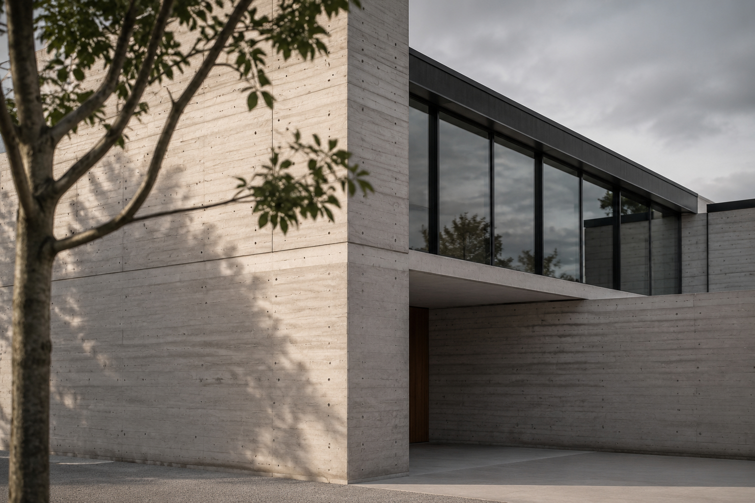
Award-winning practice specialising in cultural institutions. This concept is currently being reworked — an improved version is coming soon.

Financial services strategy firm. Deep navy, precise grid, amber accent. The kind of site a McKinsey spinoff would have if they had taste — and weren't afraid to have a point of view. Confident intelligence without arrogance.
Every design decision is a strategic one. Here is the thinking behind the three distinct visual languages.
Law firm clients looking for top-tier counsel are pattern-matching for prestige in the first eight seconds. A cream background, editorial serif typography, and restrained use of deep burgundy communicates the same things a tailored suit does — that the people behind this invest in quality and do not need to shout about it.
Architecture firms make the mistake of designing their website as aggressively as they design their buildings. The result is a site that competes with the work. Voss uses a near-black ground with maximum whitespace — the photography becomes the design. The warmth of the stone accent grounds the clinical precision of the grid.
Strategy consultants are trusted with high-stakes decisions. The site must communicate depth of thinking, not just breadth of service. Deep navy projects stability and seriousness. The amber accent is used precisely — it marks the moments that matter. The typography is tight and hierarchical, signalling rigour in everything.
Concept sites are easy to dismiss as exercises. Here is what distinguishes serious concept work from decoration.
The copy in each concept was written specifically for that firm and that client. It is not placeholder text or generic agency-speak. If it sounds like it could have been written for any firm, we failed. It should sound like it could only have been written for this one.
Every page has a conversion goal. Notice where the CTAs are placed, what they say, and why. Notice how pages are structured to move a specific type of client from uncertainty to intent. Strategy is visible in the architecture, not just the aesthetics.
Every concept site was built mobile-first. The layouts, typography, and navigation all reflow correctly at small screen sizes. For professional services, over 60% of initial site visits are on mobile. A desktop-only design is not a finished design.
The final test is simple: if you were a managing partner at a London law firm, would you believe Mercer & Stone is a real firm? If you were a cultural institution director, would Voss Studio feel credible? If the answer is yes, the work is doing its job.
Two founding slots at $2,500. Full strategy, design, and development — in exchange for case study rights once the work is live.