Harlow and Cole Legal
Repositioning a commercial law firm for the clients they actually want.

A website that reflects the quality of their work.
A twelve year reputation. A 2014 website.
Harlow and Cole had spent twelve years building one of Austin's most respected commercial law practices. Their client roster included venture-backed startups, established manufacturers, and regional real estate developers. Their work was serious. Their website was not.
The existing site was built in 2014 and had not been touched since. Dark navy background, stock photography of empty courtrooms, and six pages of dense practice area descriptions written for other lawyers — not for the business owners actually searching for legal help. The firm was growing. Their digital presence was not growing with them.

Friction at the moment of decision.
This was not a cosmetic problem. It was a positioning problem. Harlow and Cole's ideal client — a founder or CEO dealing with a contract dispute, an acquisition, or an employment issue — was landing on their website and feeling nothing. No clarity about whether this firm understood their world. No obvious next step. No sense of who Harlow and Cole actually were beyond a list of credentials.
The website was creating friction at the exact moment a potential client was ready to reach out. For a firm that had spent twelve years building trust through referrals and results, their digital presence was actively working against them.
Start with the client. Not the design.
We started with a single question. What does a business owner need to feel in the first ten seconds on this site to pick up the phone? The answer was: understood. Every decision after that came from that answer.
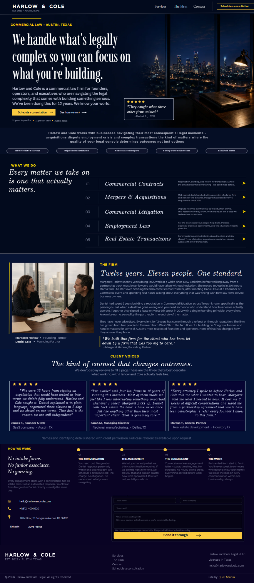
We restructured the entire site around the client's world, not the firm's credentials. Practice areas became outcomes. Attorney bios became human. The homepage stopped leading with the firm's history and started leading with the problems they solve.
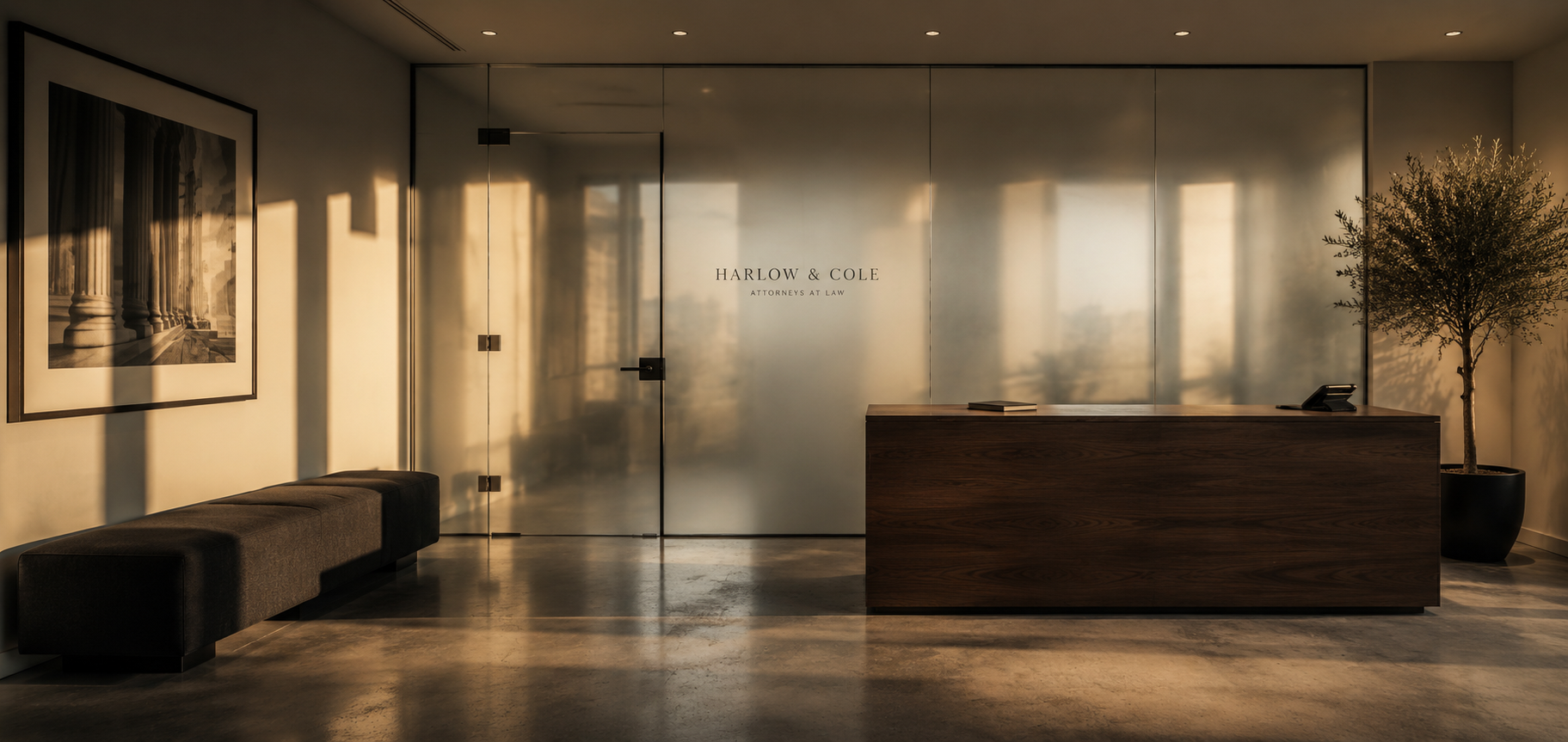
Typography: warm off-white on near black. Photography of real office environments not courtroom stock. A contact flow rebuilt around the client's journey — three questions that help the firm understand the inquiry before the first call. This reduced back and forth and made the firm look organised and professional from the very first interaction.
A website that works as hard as the firm.
A website that looks and feels like the firm Harlow and Cole actually is. Clean, confident, specific. Built to convert the right clients, not impress other lawyers.
The gap between the quality of their work and the quality of their digital presence is closed. Every element of the new site earns its place. Nothing is decorative. Everything serves the person on the other side of the screen who is deciding whether to reach out.